Unemployment Mobile
Brief
Organization
Florida's Department of Economic Opportunity (FL DEO) is the state department that aids in providing employment services and information. The UI Connect portal is designed to provide unemployment insurance benefits to Florida residents.
Project Description
The goal of this personal project was to redesign the UI Connect portal to improve mobile user experience.
Tools
InVision, Adobe Xd, UX Tweak
Problem
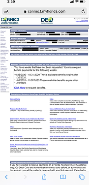
In 2020, the COVID-19 pandemic caused a historic surge in unemployment across the U.S., with Florida's rate peaking at 13.8% in April. This led to record-high unemployment insurance claims, exposing critical flaws in Florida’s outdated unemployment portal, UI Connect (connect.myflorida.com). The website was not mobile-responsive, leaving users unable to access or navigate content effectively on their phones. With no dedicated mobile experience, users faced significant accessibility challenges, compounded by frequent crashes, poor usability, and system failures. For individuals already under financial and emotional strain, these barriers heightened frustration.


Solution
I redesigned the mobile website with the following goals in mind:
-
Redesign the Mobile Claimant Login Homepage: The redesign aimed to reduce cognitive overload and frustration, improving both task accuracy and efficiency.
-
Enhance Access to Information Across Platforms: Users often need to navigate multiple sites—FloridaJobs.org, EmployFlorida.com, and mobile.connect.myflorida.com—for reemployment assistance.
-
Understand User Behavior and Emotions: This empathy-driven approach aimed to create an interface that minimizes anxiety.
Research - Site Audit
To ensure a research-driven approach, I began with a comprehensive audit of the existing UI Connect platform. Key findings included:
-
Navigation Issues:
-
The non-responsive navigation panel made links illegible on mobile devices.
-
Redundancy between bottom navigation links and the side navigation panel.
-
-
Content Accessibility:
-
External links to essential resources were difficult to find.
-
Contact information, such as FL DEO’s Twitter, support emails, and help pages, was not easily accessible.
-
-
User Experience Flaws:
-
Links were poorly grouped, ignoring user flows for specific tasks.
-
Help text for external links was unclear, leaving users confused.
-
-
Design Inconsistencies:
-
UI Connect’s colors and typography were inconsistent with other FL DEO platforms.
-
Poor use of white space impacted readability and usability.
-
Overuse of red text diluted the importance of warning messages.
-

Research - Secondary
To understand user pain points with Florida’s UI Connect platform during the COVID-19 pandemic (January–December 2020), I conducted secondary research using news articles, social media, and public data. Key findings included:
-
System Failures and Delays:
-
Florida’s unemployment benefits maxed at $275 per week, ranking among the lowest in the nation (fileunemployment.org, 2020).
-
Lawmakers called for a "complete overhaul" of UI Connect due to extensive delays and system inefficiencies:
-
“Democratic state lawmakers continue to call for changes to the state's unemployment benefits system and website…including an increase in the maximum benefit amount to $500…and a 'complete overhaul' of the DEO's CONNECT system.” – WPBF, November 2020.
-
“The system was implemented in a way for it to be a total failure…even before the pandemic, people were having a really hard time not only applying but in getting benefits.” – Sen. Annette Taddeo via ABC News, April 2020.
-
-
-
User Frustrations:
-
A Floridian shared: “After Ernst Virgile lost his job…he sat up late at the computer…refreshing his browser again and again while his wife was sleeping.” – NY Times, April 2020.
-
On FL DEO’s social media: “Back LWA payment request processing has been delayed to anywhere from 10 to 12 weeks. No explanation offered.” – Facebook, November 2020.
-
-
Accessibility Challenges:
-
Research showed 50% of U.S. adults can’t read at an eighth-grade level (Washington Post, 2016), emphasizing the need for plain language and accessible design.
-
These findings highlighted the urgency for a responsive, user-friendly, and inclusive mobile platform redesign.
Research - Primary
Primary research included card sorting, a usability evaluation of the UI Connect login homepage on mobile, and interviews. After refining questions through a pilot study, I recruited five participants (via personal network and UpWork) and a Floridian Employment Specialist.
Card Sorting
Using UX Tweak, participants grouped links currently provided on UI Connect. Findings revealed:
-
Certain link labels were unclear with or without context.
-
Many links seemed closely related but were not grouped logically.
Interview
Interviews uncovered user pain points and provided eight key themes:
-
Aesthetics:
-
Fonts need to be larger and more legible.
-
Color palette lacks consistency.
-
-
Perception of Florida’s Unemployment Support:
-
Pre-existing negative views of Florida shaped perceptions of UI Connect.
-
News and personal experiences amplified frustration.
-
-
Knowledge of UI Connect:
-
Users faced consistent access issues and unclear steps for filing claims.
-
Customer support calls were often unhelpful.
-
-
Plain Language:
-
Website content requires simpler, clearer language and action-based link labels.
-
-
Information Architecture:
-
Content appears cluttered, overwhelming cognitive load.
-
Prioritization of information is needed.
-
-
Comparisons to Financial Apps:
-
Banking apps are simpler and better optimized for mobile.
-
-
Emotions During COVID-19:
-
Interactions with UI Connect triggered frustration and anxiety.
-
-
Missing Resources:
-
Job market insights and skill-building resources are not easily accessible.
-


Prototypes
Low Fidelity Sketches
Low-fidelity sketches were created based on internal research, secondary findings, and the initial goals of the project. These sketches focused on enhancing the content hierarchy, improving information architecture, and increasing the visibility of help links and social media links. They also incorporated a mobile-friendly design with sticky navigation to improve usability. A key challenge during this process was determining the best placement for legal statements and language selection options to ensure accessibility and compliance.


Mid-Fidelity Wireframes
I used InVision to create the wireframe for UI Connect, which allowed me to add notes as I designed, though I couldn’t test links at this stage. The user flow evolved as I conducted further research. Key changes included:
-
Moving the "Select A Language" dropdown from the privacy and fraud acknowledgment page to the mobile landing page.
-
Removing the pop-up link for claiming unclaimed benefits, initially included in my sketches.
-
Struggling with how to display external links, not including the "Claimant Home," "Messages," and "Unclaimed Benefits" pages. I debated between adding a "Resources" link in the bottom menu, which would provide an image and explanation of links, or opting for a burger menu for cleaner navigation.
Final Designs
Visual Design and Branding
Before diving into the final designs, I considered the existing branding to ensure consistency with other FL DEO sites. First, I incorporated colors from the mobile login page. This choice not only maintained brand consistency but also allowed for future scalability. I also integrated colors from the FL DEO and FloridaJobs websites, along with the FL DEO logo, to strengthen the unified visual identity. Additionally, I applied color psychology, using dark blue to evoke trust, reliability, and a calming effect, which aligns with the emotional needs of users navigating a stressful system.


Final Screens
I used Adobe XD to create the high-fidelity prototype for UI Connect. The user flow and information architecture were influenced by mobile banking apps and responsive websites, as many participants mentioned checking financial information via banking apps. Key design decisions included:
-
Emphasizing claimant information and benefits with color and whitespace for clarity.
-
Making the contact page a prominent link in the menu bar, reflecting user feedback that many claimants contact DEO Customer Service frequently.
-
Adding links to FloridaJobs.org and the DEO’s social media for users to share experiences and seek further insights.
-
Organizing additional links into an accordion menu under "Frequently Asked Questions," providing context for terms identified as unclear in the card sorting activity.
Reflection
This project does not address all concerns surrounding Florida’s unemployment support, such as issues with maximum benefit amounts, customer service challenges, and the application process, which were outside the scope of this redesign. Additionally, websites connected to UI Connect, like FloridaJobs.org, had their own user experience problems not covered in this project.
I faced several constraints and gaps in information that influenced design decisions. For example, without a clear understanding of the reasoning behind the differing login methods on UI Connect and mobile.connect.myflorida.org, I opted for the login process more aligned with the mobile platform for consistency. Another challenge was recruiting participants for user research, as discussing unemployment—a sensitive and personal topic—proved difficult for many, which impacted participant incentives.
Despite these challenges, I believe the redesign can have a meaningful impact on the state of Florida’s unemployment support, especially considering the attentional control theory and user empathy in design. Moving forward, further usability testing and research are essential to uncover more pain points and continue improving the platform. This project also reinforced the importance of incorporating empathy, especially when addressing sensitive topics like unemployment, and highlighted the critical role of accessibility design in ensuring that all users can effectively interact with the platform.